
Niveau :


7 minutes de lecture

The new RC9 release for MAUI brings a lot of new features, including an all-new control that provides title bar functionality for a window. Let’s explore this together and put some examples into practice.
Presentation of the TitleBar
Please note, at the time of writing this article, TitleBar is not yet available for Mac Catalyst.
The TitleBar allows the display of a customized title bar in a Windows. Several parameters can be adjusted to modify the graphical elements and their behaviors. Below is a schematic representation of the main properties and their actions:
- Content, of type IView, which specifies the control for the content that’s centered in the title bar, and is allocated the space between the leading and trailing content.
- DefaultTemplate, of type ControlTemplate, which represents the default template for the title bar.
- ForegroundColor, of type Color, which specifies the foreground colour of the title bar, and is used as the color for the title and subtitle text.
- Icon, of type ImageSource, which represents an optional 16x16px icon image for the title bar.
- LeadingContent, of type IView, which specifies the control for the content that follows the icon.
- PassthroughElements, of type
IList<IView>, which represents a list of elements that should prevent dragging in the title bar region and instead directly handle input. - Subtitle, of type
string, which specifies the subtitle text of the title bar. This is usually secondary information about the app or window. - Title, of type
string, which specifies the title text of the title bar. This is usually the name of the app or indicates the purpose of the window. - TrailingContent, of type IView, which specifies the control that follows the
Contentcontrol.
Démonstration :
In the Visual Studio 2022 Preview version, create a new MAUI project:
Add a new Windows .NET MAUI Window (XAML): MainWindow.xaml. Paste the following code into the xaml file:
<?xml version="1.0" encoding="utf-8" ?>
<Window xmlns="http://schemas.microsoft.com/dotnet/2021/maui"
             xmlns:x="http://schemas.microsoft.com/winfx/2009/xaml"
             x:Class="CoffeeCodingTitleBar.MainWindow"
             xmlns:Local="clr-namespace:CoffeeCodingTitleBar"
             Title="MainWindow">

    <Window.Page>
        <Local:AppShell x:Name="AppShell" />
    </Window.Page>
    <Window.TitleBar>
        <TitleBar Title="Coffee Coding"
               Subtitle="TitleBar sample"
               BackgroundColor="AliceBlue"
               ForegroundColor="DarkBlue"
               HeightRequest="48">
            <TitleBar.Content>
                <SearchBar Placeholder="Search"
                        PlaceholderColor="DarkBlue"
                        BackgroundColor="LightBlue"
                        MaximumWidthRequest="300"
                        HorizontalOptions="FillAndExpand"
                        VerticalOptions="Center"/>
            </TitleBar.Content>
            <TitleBar.TrailingContent>
                <ImageButton HeightRequest="36"
                     Source="dotnet_bot.png"
                     WidthRequest="36"
                     BorderWidth="0"
                     Background="Transparent"/>
            </TitleBar.TrailingContent>
        </TitleBar>
    </Window.TitleBar>
</Window>
Modify the App.xaml.cs file as below to launch the newly created window at startup:
protected override Window CreateWindow(IActivationState? activationState)
{
    return new MainWindow();
}
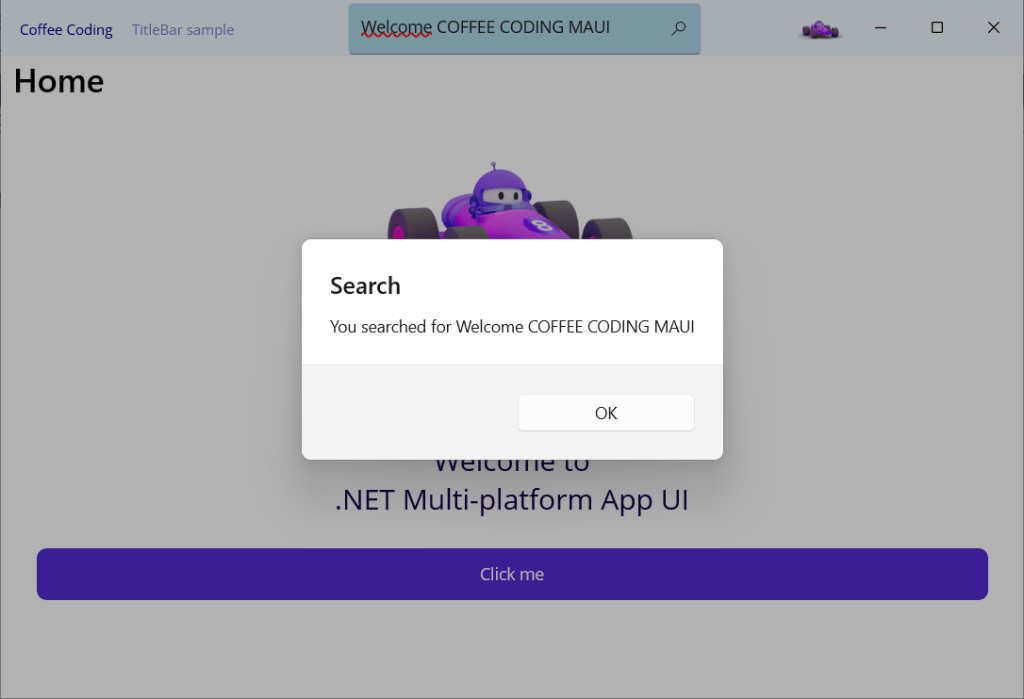
Execute the project to obtain the visual below:

Let’s add an event in the search area as below:
<SearchBar Placeholder="Search"
        PlaceholderColor="DarkBlue"
        BackgroundColor="LightBlue"
        MaximumWidthRequest="300"
        HorizontalOptions="FillAndExpand"
        VerticalOptions="Center"
        SearchButtonPressed="SearchBar_SearchButtonPressed" />
namespace CoffeeCodingTitleBar;

public partial class MainWindow : Window
{
    public MainWindow()
	{
		InitializeComponent();
	}

    private async void SearchBar_SearchButtonPressed(object sender, EventArgs e)
    {
		var result = sender as SearchBar;
		await AppShell.Current.DisplayAlert("Search", $"You searched for {result.Text}", "OK");
    }
}

 Coffee Coding